Find answers, guides, and tutorials instantly
Press Esc to close or Enter to search
Learn Ghost Theme documentation for fast setup, customization, and expert tips to launch your Ghost site.
Complete documentation guide
Learn - Ghost LMS Theme is a modern, responsive, and feature-rich Ghost theme built specifically for educational websites, online courses, and eLearning platforms. Whether you’re an institution, independent educator, or content creator, Learn provides all the tools you need to build a great learning experience on the Ghost platform.
Note: This theme does not include full LMS functionality (e.g., quizzes, progress tracking, certificates). It leverages Ghost’s native membership feature to lock lessons and course content for members only.
With Learn, you can seamlessly publish lessons, tutorials, and educational materials while engaging your audience with a clean and intuitive user experience.
Loading content...
Loading content...
Loading content...
Loading content...
Loading content...
Loading content...
Loading content...
Loading content...
Loading content...
Loading content...
Loading content...
Loading content...
The Learn Ghost Theme includes special custom settings that allow you to adjust the appearance and functionality of your site directly from the Ghost Admin Panel.
These options give you full control over colors, layouts, cards, headers, and additional theme features—without editing any code.
You can find these options inside:
Ghost Admin → Settings → Design → Site-wide Settings
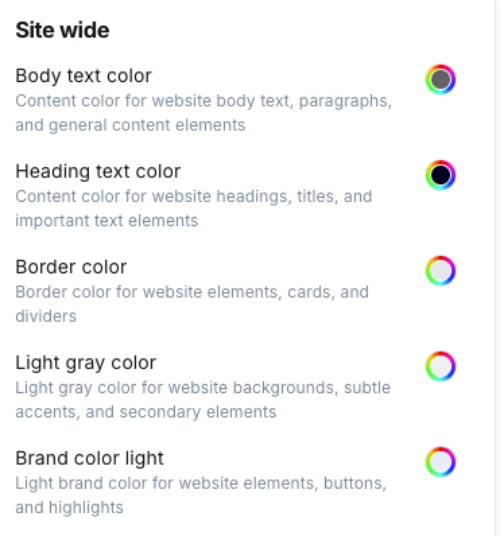
These settings let you align the theme with your brand identity. All color pickers support HEX codes, so you can match your exact design palette.
Body Text Color
Default: #575961
Defines the default color of all text in body content, including paragraphs and list items.
Tip: Use a darker gray for better readability instead of pure black.
Heading Text Color
Default: #022249
Controls the color of headings (h1, h2, h3, etc.).
Tip: Use your brand’s primary color to make headings stand out.
Border Color
Default: #e5e7eb
Applies to borders around cards, forms, and dividers.
Tip: Keep this neutral (light gray) for a clean look, or switch to brand tones for more emphasis.
Light Gray Color
Default: #f6f5f5
Used for subtle background areas, section separators, and muted highlights.
Tip: Ideal for section blocks behind testimonials, feature grids, or course previews.
Brand Color Light
Default: #e6eefd
A lighter accent version of your brand color, used on buttons, highlights, and hover effects.
Tip: Pair this with your main brand color for consistent CTAs.
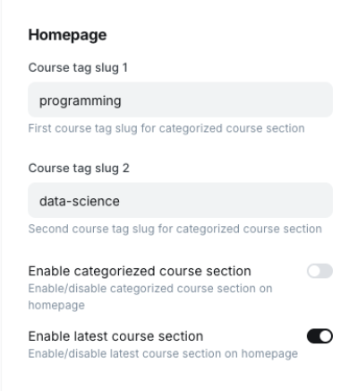
These settings let you control special sections on the homepage layout.
Course Tag Slug 1
Default: android
The first tag used to display a categorized block of courses on the homepage.
Example: If you enter design, all posts/courses tagged with design will appear here.
Course Tag Slug 2
Default: web-development
The second tag for another categorized block of courses.
Example: Use this for popular topics like marketing or seo.
Enable Categorized Course Section
Default: true
Turns the categorized course blocks on or off.
Enable Latest Course Section
Default: false
Displays the most recently published courses on the homepage.
Great for keeping your site fresh if you publish often.
These settings define how blog posts appear and behave.
Post Share Enabled
Default: true
Shows or hides social media share buttons at the bottom of each post.
Disable if you want a distraction-free reading experience.
Post Header Style
Options:
No Image → Text-only headerImage on Right → Title on left, feature image on rightImage on Left → Title on right, feature image on leftImage on Top → Feature image above the titleImage on RightNo Image for minimal layouts, or Image on Top for a more blog-like feel.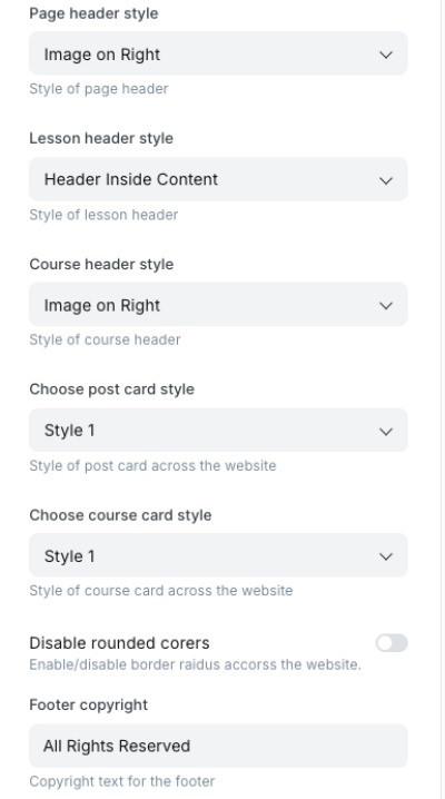
These settings apply to static pages, course lessons, and course detail pages.
Page Header Style
Options: No Image, Image on Right, Image on Left
Default: Image on Right
Controls how static page headers (like About, Contact, etc.) are displayed.
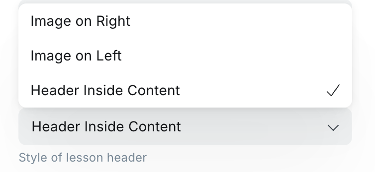
Lesson Header Style
Options: Image on Right, Image on Left, Header Inside Content
Default: Image on Right
Defines how lesson pages display their titles and media.
Tip: Use “Header Inside Content” for a tighter layout when lessons are short.
Course Header Style
Options: Image on Right, Image on Left
Default: Image on Right
Defines how the main course detail page header is displayed.
Tip: Keep consistency across all courses for a professional look.
Control the design of the “cards” used across your site for courses and posts.
Choose Post Card Style
Options: Style 1, Style 2, Style 3
Default: Style 1
Changes the layout of blog post previews (image orientation, metadata placement, etc.).
Choose Course Card Style
Options: Style 1, Style 2
Default: Style 1
Changes the layout of course previews.
Tip: Try different styles to see which makes your course catalog more engaging.
falseAll Rights Reserved© 2025 Learn Ghost. All Rights Reserved.With these customization options, you can:
All of this can be done directly from Ghost Admin without touching any code, making it beginner-friendly yet powerful.
The Learn Ghost theme includes three unique header styles for lessons. These header layouts give you the flexibility to display the featured image in different positions, allowing you to customize the look and feel of your lesson pages.
You can easily configure the image position directly from the lesson settings. The available options are: Left, Right, and Top.
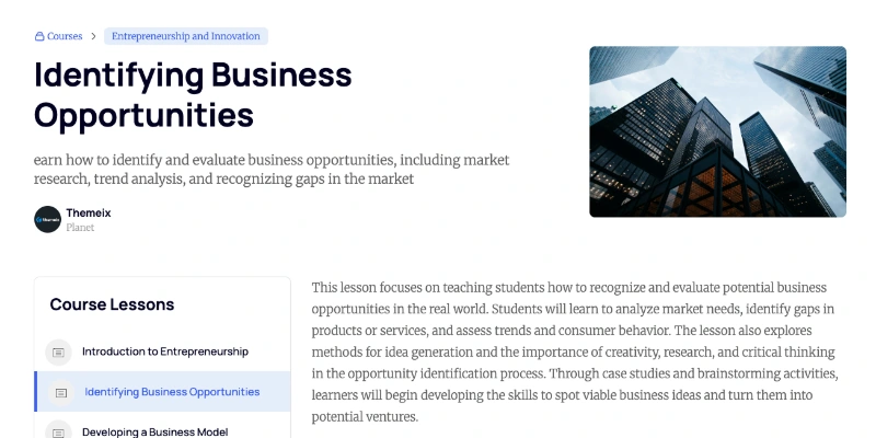
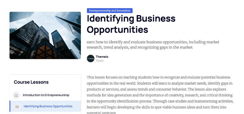
Sometime you may want to display the lesson title and content without an image.
Installing Your Ghost Theme
Follow these simple steps to install your new Ghost theme:
yourwebsite.com/ghost).sinju.zip) in your downloaded package.That’s it! Your Ghost site should now be using the new theme. If you have any issues, double-check that you uploaded the correct ZIP file and that the upload finished successfully.
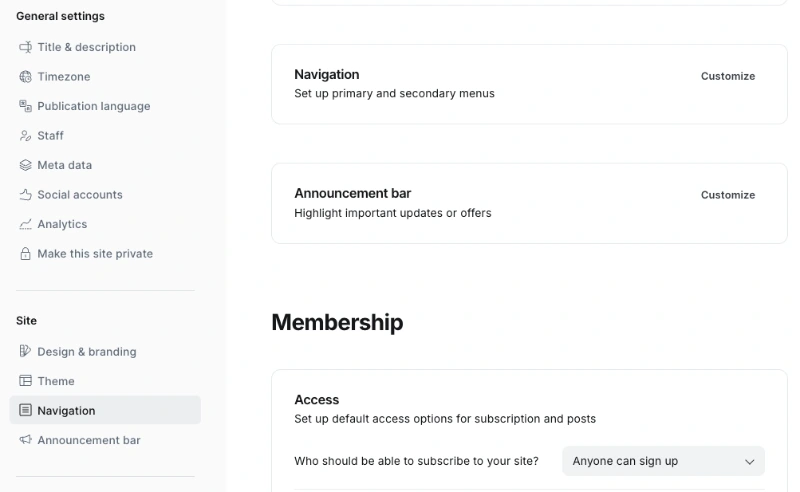
Managing your site’s navigation in Ghost is simple and user-friendly. You can add, remove, reorder, or edit menu items directly from the Ghost Admin Panel, without editing any code.
To access the navigation settings:
Example direct link:
yoursite.com/ghost/#/settings
Within the Navigation section, you can fully customize your site’s menu:
/about/, /contact/).For more details, see the official Ghost docs: Updating Navigation
By following these steps, you’ll keep your site’s navigation clean, intuitive, and up to date with the latest Ghost features.
Ghost CMS provides a Featured Post option that allows you to highlight specific content on your site. In themes that support this functionality (including ours), featured posts are displayed prominently on the frontend.
If you have more than one featured post, they will automatically be displayed on the theme. This is a great way to draw attention to important content, such as announcements, popular articles, or cornerstone content.
To mark a post as featured:
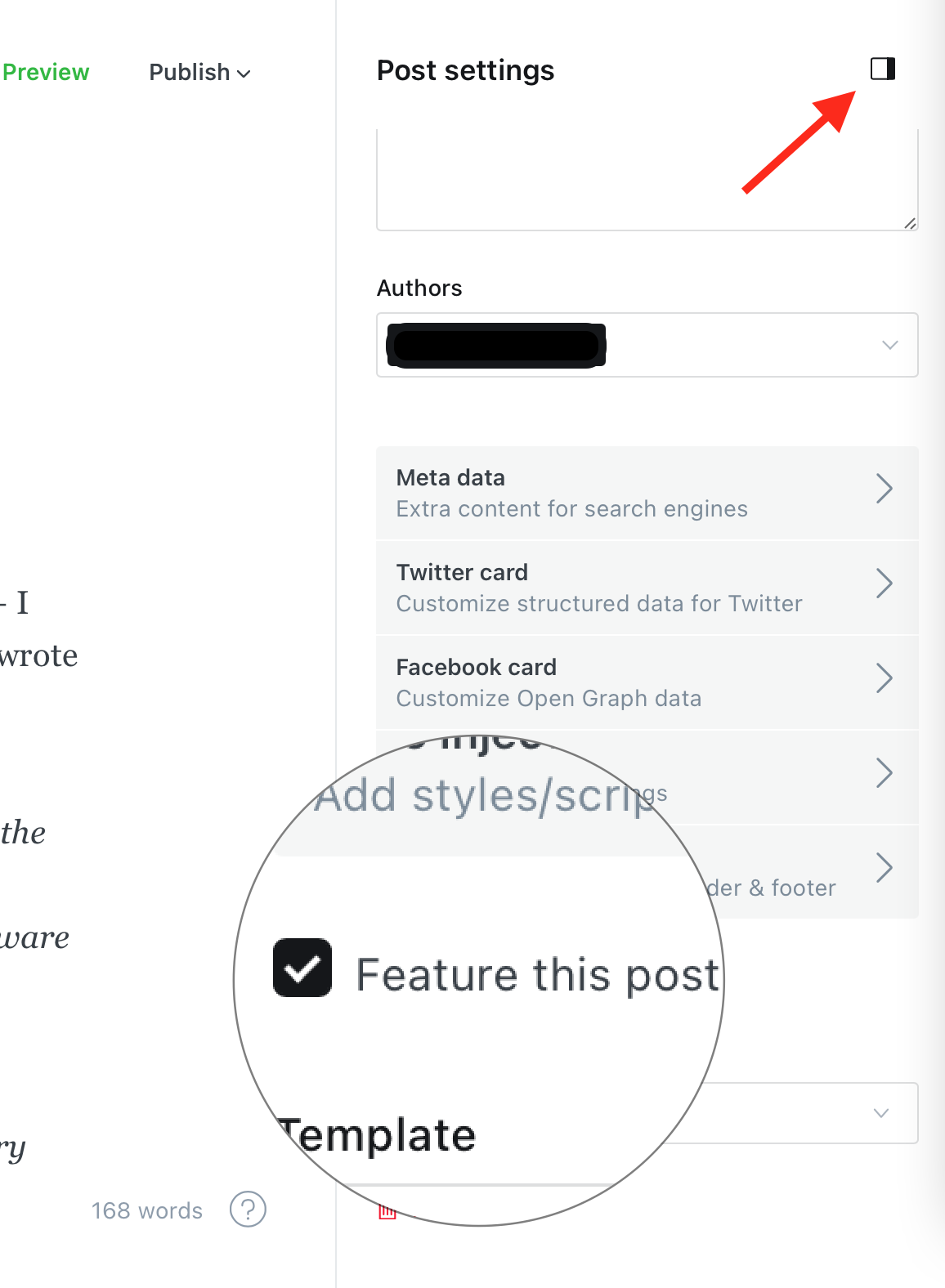
Once a post is marked as featured:
Since featured posts receive the feature class, you can target them specifically in your CSS for custom designs — such as different backgrounds, font styles, or animations.
Using featured posts effectively can help improve engagement and guide your readers to the most important content on your website. Be sure to keep the section updated with fresh or strategic posts to make the most of this feature.
In the Learn Ghost theme, we have added a dynamic dropdown feature for navigation. This allows you to easily set up your site’s menu directly from the Ghost Admin panel.
Home
- Home v1
- Home v2
- Home v3
Courses
Pages
Blog
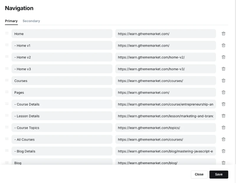
[-] in front of any parent navigation item that has dropdown child items.- under the parent.Ghost also supports a Secondary Navigation option, which you can set up similarly in the admin panel. However, the secondary navigation does not support dropdowns and is usually displayed in the footer area.
This guide walks you through the process of adding a lesson in Ghost CMS, covering everything from setting lesson details to managing access and tags.
Important: Ensure you are creating a Post and not a Page when adding a lesson.
Start by entering the core information about your lesson:
We recommend enabling the Ghost Public Preview feature when adding your lesson description. This option allows non-members or visitors to preview the lesson overview without full access.
Why use Ghost Public Preview?
For premium lessons, if you do not enable Public Preview, visitors won’t be able to see the course description unless they are members with access. Enabling this option makes the lesson more visible and appealing to potential students.
In our setup, we have used the Ghost Public Preview option to ensure the lesson description is visible.
Tags are essential for organizing and internal referencing of lessons and courses.
Each lesson must include exactly two internal hashtags:
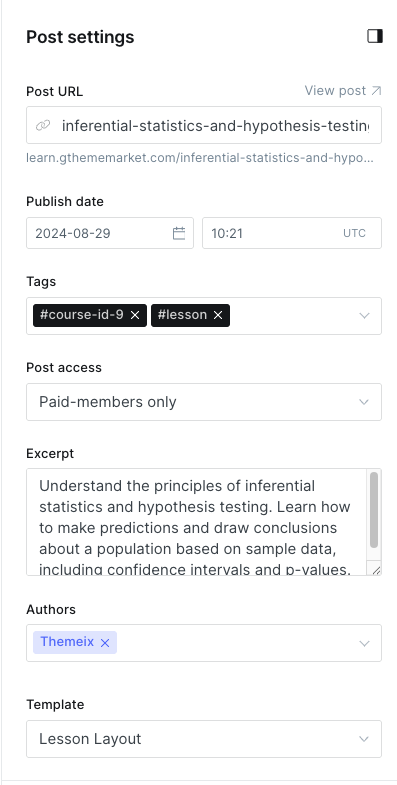
#course-id-X — where X is the unique ID number for the course (e.g., #course-id-2)#lesson — this tag is required for all course lessonsExample: #course-id-2 #lesson
You can also add public-facing tags or lesson categories to improve discoverability and grouping.
Example: UI UX Design
#course-id-2, #course-id-3, #course-id-4.#lesson tag.Ghost CMS supports three main types of post access levels to control who can view your lesson content:
Public Access:
Use this setting for free lesson or lessons that everyone can view.
Basic Membership Access:
This restricts access to users who have subscribed to the basic membership tier. It is recommended for some premium lesson.
Premium Membership Access:
This grants access to all premium content for members who subscribe to the highest tier.
Tip: For premium lessons, always assign the correct membership tier to control who can access your content effectively.
We recommend using Basic Membership for selected premium lessons and Premium Membership for all-access passes.
Every lesson should clearly specify the author’s name. This helps learners know who created the content and adds credibility.
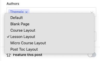
Choose the appropriate Lesson Layout Template to define how the lesson content will be presented on your site.
#course-id-X and #lesson.Following these steps will help you maintain a consistent and well-organized lesson catalog on your Ghost CMS site.
If you need any assistance or have questions, feel free to reach out to your site administrator or consult the Ghost documentation.
This guide walks you through the process of adding a course in Ghost CMS, covering everything from setting course details to managing access and tags.
Important: Ensure you are creating a Post and not a Page when adding a course.
Start by entering the core information about your course:
We recommend enabling the Ghost Public Preview feature when adding your course description. This option allows non-members or visitors to preview the course overview without full access.
Why use Ghost Public Preview?
For premium courses, if you do not enable Public Preview, visitors won’t be able to see the course description unless they are members with access. Enabling this option makes the course more visible and appealing to potential students.
In our setup, we have used the Ghost Public Preview option to ensure the course description is visible.
Tags are essential for organizing and internal referencing of lessons and courses.
Each course must include exactly two internal hashtags:
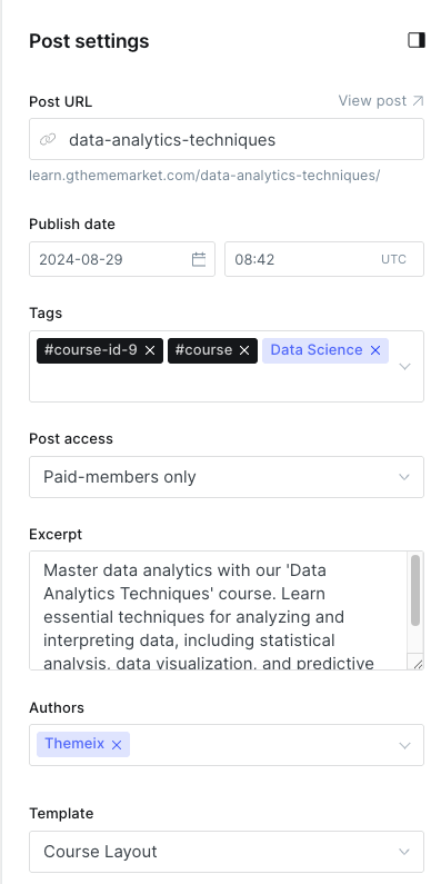
#course-id-X — where X is the unique ID number for the course (e.g., #course-id-9)#course — this tag is required for all coursesExample: #course-id-9 #course
You can also add public-facing tags or course categories to improve discoverability and grouping.
Example: UI UX Design
#course-id-2, #course-id-3, #course-id-4.#course tag.Ghost CMS supports three main types of post access levels to control who can view your course content:
Public Access:
Use this setting for free courses or lessons that everyone can view.
Basic Membership Access:
This restricts access to users who have subscribed to the basic membership tier. It is recommended for some premium courses.
Premium Membership Access:
This grants access to all premium content for members who subscribe to the highest tier.
Tip: For premium lessons, always assign the correct membership tier to control who can access your content effectively.
We recommend using Basic Membership for selected premium courses and Premium Membership for all-access passes.
Every lesson should clearly specify the author’s name. This helps learners know who created the content and adds credibility.
Choose the appropriate Course Layout Template to define how the course content will be presented on your site.
#course-id-X and #course.Following these steps will help you maintain a consistent and well-organized course catalog on your Ghost CMS site.
If you need any assistance or have questions, feel free to reach out to your site administrator or consult the Ghost documentation.
Ghost CMS allows you to create custom pages using templates, including one that can automatically display all your tags. This is useful for organizing your content and helping visitors explore topics on your site.
Follow the steps below to create a dedicated Tags page:
After assigning the tags page:
tags.hbs template is defined in your theme.By using this method, you can easily create a dynamic Tags page that updates automatically as you add new tags to your content.
Adding analytics or other third-party scripts (like Google Analytics, Facebook Pixel, Hotjar, or custom JavaScript/CSS) to your Ghost website is easy and doesn’t require editing the theme files directly.
Follow these steps to safely inject custom code into the header of your Ghost site:
First, log in to your Ghost Admin panel. This is usually accessible at:
Once logged in, click on the Settings icon located in the left sidebar.
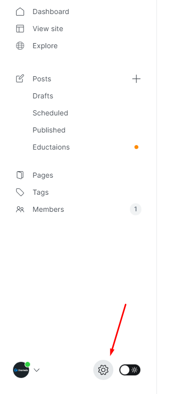
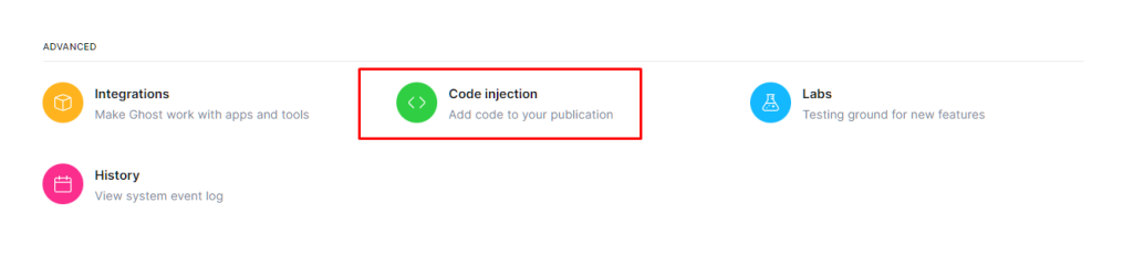
In the Settings panel, scroll down to the Advanced section. Click on Code Injection.
This area allows you to safely inject custom code into your site’s <head> and <footer> sections without modifying your theme files.
Under the Header section, paste your Google Analytics code, tracking scripts, meta tags, custom CSS, or any other header-level scripts.
This code will be automatically added to the <head> section of every page on your site.
Here’s a sample script you can paste into the Header field to enable Google Analytics:
<!-- Google Analytics -->
<script
  async
  src="https://www.googletagmanager.com/gtag/js?id=UA-XXXXXXX-X"
></script>
<script>
  window.dataLayer = window.dataLayer || [];
  function gtag() {
    dataLayer.push(arguments);
  }
  gtag("js", new Date());

  gtag("config", "UA-XXXXXXX-X");
</script>
Replace UA-XXXXXXX-X with your actual Google Analytics Tracking ID.
Creating an Authors page in Ghost CMS allows you to showcase all the contributors to your site in one place. If your theme includes a custom authors.hbs template, you can easily use it to automatically generate a list of all authors.
Follow the steps below to create a dedicated Authors page:
After assigning the authors page:
authors.hbs template is defined in your theme.By using this method, you can easily create a dynamic Tags page that updates automatically as you add new tags to your content.
Creating a functional and visually appealing Contact page in Ghost is simple. Follow the steps below to get started:
To make your Contact page functional, you can integrate a form. Below are three recommended tools to easily add a contact form to your Ghost site:
Google Forms and Jotform can be embedded directly into your Ghost page using an <iframe>.
<iframe
  src="YOUR_FORM_URL_HERE"
  width="100%"
  height="500"
  frameborder="0"
  marginheight="0"
  marginwidth="0"
  >Loading…</iframe
>
To use Formspree, paste the following form code into your page’s HTML section:
<form
  class="themeix-contact-form"
  action="https://formspree.io/your@email.com"
  method="POST"
>
  <input type="text" name="your-name" placeholder="Your Name" required />
  <input type="email" name="_replyto" placeholder="Email" required />
  <textarea name="message" placeholder="Message" required></textarea>
  <button type="submit" class="themeix-contact-btn">Send Message</button>
</form>
Replace
your@email.comwith your actual email address registered with Formspree.
<form
  class="themeix-contact-form"
  action="https://submit-form.com/your-form-id"
>
  <input
    type="hidden"
    name="_redirect"
    value="https://your-website.com/thanks"
  />
  <input type="text" name="name" placeholder="Your Name" required />
  <input type="email" name="email" placeholder="Email" required />
  <textarea name="message" placeholder="Message" required></textarea>
  <button type="submit" class="themeix-contact-btn">Send Message</button>
</form>
Replace
your-form-idwith your actual form id.
You can customize the appearance of your form by adding inline styles or editing your theme’s CSS. Here’s a quick example for custom button and element colors:
<style>
  .themeix-contact-form {
    max-width: 600px;
    margin: 2rem auto;
    padding: 2rem;
    background-color: #ffffff;
    border: 1px solid #e5e7eb;
    border-radius: 12px;
    box-shadow: 0 10px 25px rgba(0, 0, 0, 0.05);
    display: flex;
    flex-direction: column;
    gap: 1.2rem;
  }

  .themeix-contact-form input,
  .themeix-contact-form textarea {
    width: 100%;
    padding: 0.8rem 1rem;
    border: 1px solid #d1d5db;
    border-radius: 8px;
    font-size: 1rem;
    transition: border-color 0.3s, box-shadow 0.3s;
  }

  .themeix-contact-form input:focus,
  .themeix-contact-form textarea:focus {
    border-color: #6366f1;
    box-shadow: 0 0 0 3px rgba(99, 102, 241, 0.2);
    outline: none;
  }

  .themeix-contact-form textarea {
    min-height: 120px;
    resize: vertical;
  }

  .themeix-contact-btn {
    background-color: #6366f1;
    color: #ffffff;
    border: none;
    padding: 0.9rem 1.4rem;
    font-size: 1rem;
    border-radius: 8px;
    cursor: pointer;
    transition: background-color 0.3s ease;
  }

  .themeix-contact-btn:hover {
    background-color: #4f46e5;
  }
</style>
With these steps, your Ghost site will have a professional Contact page that includes a working form and styling that matches your brand.